Imagemagick useful cmds: basic bash select, image resize, crop, creation

Imagemagick adapted personal notes.

Most times when I want to do something on several images I use artscript, a small GUI tool to automate most common, and not so common, imagemagick operations. It makes a breeze to prepare a set of images to display on one or several output sizes and formats. artscript backbone is imagemagick command line program, mainly what artscript does is compose the command line option to make imagemagick do its thing.

The remaining times artscript doesn’t fit my imagemagick needs I find it useful to remember the following commands.

General image selection

Use terminal utilities to filter the wanted images and feed the result to either *xargs* or a *for/do loop*. The most common utilities, and easier to remember are: ls and find.

ls

List all files in a directory, using wildcards from bash its possible to filter the results easily.

 $ ls *.png ## list all png
 $ ls draw_*.jpg ## list all jpg starting with 'draw'

find

For queries more complex or uncertain I use find. find queries can be very complex on its own

$ find . -name '*.ora' ## finds all file and dirs ending with '.ora' (used * wildcard again)
$ find . -type f -name '*.?[pn]?' -ctime -30 ## finds all png and jpg files in current dir created in the last 30 days.

## spaces in characters will break the pipe, use print0 to feed xargs
$ find . -name '*.jpg' -print0

When doing a for loop its not necessary to use xargs, and its possible to feed the bash mini script with patters, this is specially usefull when you know exactly the image you are going to process.

## Inspect all files patterns between 044, 045, 046.. until 050.
## any command can go after the do.
$ for f in 14_{030..050}.ora ; do file $f; done

## Using xargs
$ echo 14_{030..050}.ora | xargs file

Creating Images

Read More »

Painting with index colors filter

Krita

Working with index color filter, described here https://krita.org/item/236-last-week-in-krita-week-21, can be confusing. The filter works so slow (in my pc) that getting results just by moving sliders is a waste of time. Some things are good with the tool and some others are hideous. I wanted to work with index colors to get the messy pixely effect and also using live filters to edit anything later (if it’s needed). here are some notes on the tools to avoid future headaches.14_189fs_net
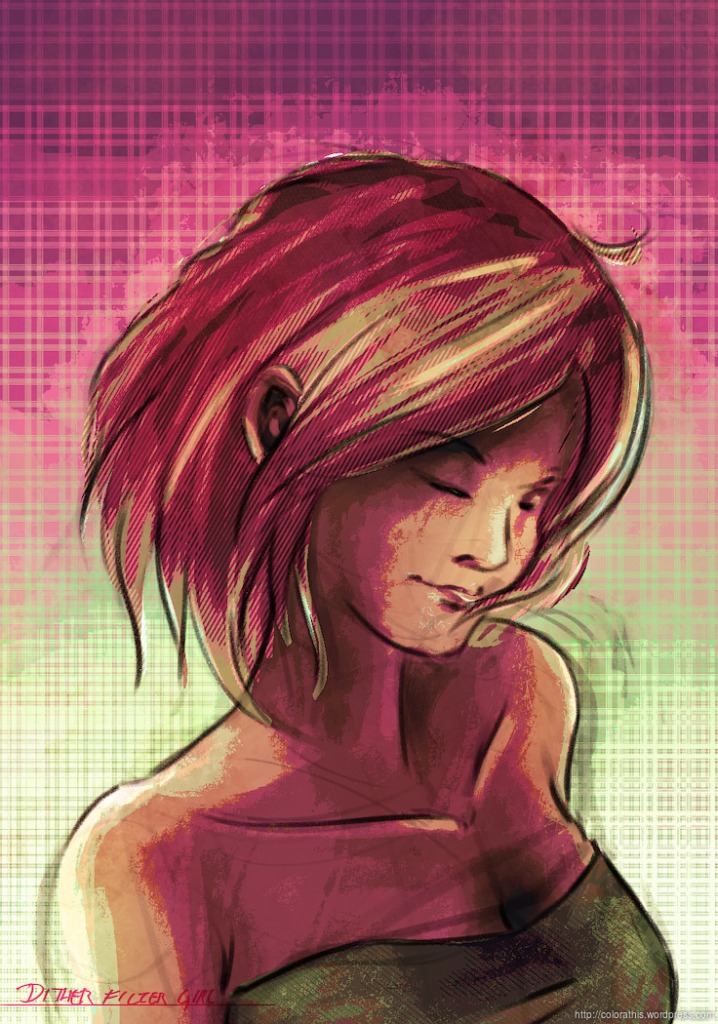
Above: my result. Used the same layer setup as in the video here https://www.youtube.com/watch?v=v1Z__mSfo8s (whoppix was very kind to share the file). To control a little better the output. I worked in gray scale all the way and used 4 main groups. Background, Clothes, Skin, Hair. The idea at first was to use a different colour on each section and a slightly different dithering effect on each.

Layer Stack description (As in source file)

Set a group for each dithered object you need. each group act as an isolation environment so its possible to get different colors and dithering patterns on different elements in canvas.

  • Top layer: Dithered filter
    – Ramps: Brigth 3 colors, Light, base and Dark 1 color each
    – Diagonal Grafients ON
    – Gradient steps: 3 / L 4 / B 5 / Shadow 5
    – Limit to:  Indexing factors ( move at will)
    -Alpha steps 1
  • Group Layer: Dither layers (Op: 16%)
    Grayscale texture dither patterns
  • Paint layer. This is the where the object is made.

On Dither patterns and textures

Layer must have opacity lower than 20 to add the effect without interfering with the painting itself. If it is too high the pattern will become the painting instead of just dithering the gradients. You can use any data as dithering patterns. I only tested grayscale layers and different types of layer content. From what I can observe:

  •  Sharp pixel shape patterns with different gray values work best
  • Its possible to use krita painting brush patterns to add dither, results are more or less nice. (Used on the background)
  • Add any image texture and tweak values to make nice dither. This came come from a photo or a painting. Krita grayscale patterns enter this category
  • Use a brush engine to generate Texture. this is trickier since you need to generate an organic pattern for it to look good. (Ramon miranda’s hairy brush set works extremely well for this.)

Brush engines tested and settings

Painting with Brush patterns Grayscale textures: Set Cut Off Policy to “Brush” and set arrows. black on middle, white closer to edge.
Painting with spray to generate dither:
Spray brush:
Size off
Shape dynamics, Random size?
Paint mode BuildUp, (Wash with Random Opacity in “Color options” doesn’t seem to work)
Spray area: Diameter, Scale, Particle count alter the way the dither is “rendered”
I ended up using Turning off: Spray Shape and setting the brush set tip to 1px, more or less.
Hatching brush: Ok This one works very well for creating gradient dithering. however the results are hard to control
Hair brush: Very Good, just lower opacity to control texture amount
I have: Opacity 94%, Ink depletion: ON (1024, opacity)
Sketch brush: Could work
Brush size: Offset scale above 80%, density low, Ucheck “use distance density”, Uncheck “Magnetify”

Speed problems?

Live filtering is very slow at the moment, to avoid the trouble of working at snail speeds get used to work in Grayscale (values only) and turn on index colors filtering for fine adjustments.

Controlling color output

14_190_net

This is a tricky business. I tried many different variations and I could obtain the same color combinations from different color mixtures in the dark, base, light, bright color swatches.
The colors provided by default work well as long as you don’t alter the value. In other words they will affect the gradient at the same bright tones as long as you don’t alter the value setting.
In the end I made the following process
  • Removing all swatches and leaving base will create a cut out shape with the color selected.
  • Add then a light tone for getting gradient variations. The colors are not exactly the ones you picked, but very close
  • You can use second and third rows, jumping wrows will make a strong gradient effect. however use with care as activating them might cause unwanted color shifting.
  • Color value is everything. Add a Bright tone with very dark value and you will affect the dark tones. Add light value to Dark column and highlight will get colored, despite being in the dark column. Not sure if this is a bug but, use this to your advantage to fine tune dark tones a little bit in the end.
  • Because of the former point, have some order, using values from light to dark, top to bottom.
  • Activate diagonal gradients to use any column and get mostly the same effect as if you were using only one column. I have to investigate this further as the option might imply some other things.

Adding screenshots showing color mixing variations.


Conclusions

The results from this technique are strongly dependant on your value mastering and for more aesthetically appealing picture you have to prepare a nice set of patters and use them with care. Failing to do so will result in a muddy picture with no volume and zero flow on forms. Very difficult indeed to get. My pictures ire nowhere near that level. Finally, while the results are satisfactory I still need to master the coloring mistery for selecting the exact colors I want. I could help to set a gradient inside the affected area to help selecting the color ramps. In the end I had to use level and color balance to get a brighter look on the first image.

Second image was better controlled in respect to color setting in the filter. I started working on it with the experimental brush to focus only on hard shapes. Abusing Krita layers ystem I worked as with the red marker and light yellow for the background, cloned the resulting group layers. Added those clones to the indexed layer and toyed with the index filtering colors.

Get the Source files

Krita tip: Ease setup 1 point perspective assistant

Going trough a perspective course at Crimsom Daggers I decided not only to make the exercises but to get them to a certain level of presentation. (I keep the sepia like scheme as I find out I can work for larger periods of time with it).

Using Krita assistants tools not only allows for faster work but also cleaner and more organized look. For diagonals outside the grid I switched to the line tool.  I used a few layers to organize shapes and soften most construct lines and some masks to keep lines from overlapping.

net_1point2nd_blog

Setting up a grid

Setting a one point perspective grid is super easy with some planning. The following short video will show you the steps to achieve it.

The most important thing to remember:

  • Set an outer square area to align the cage outer sides
  • Draw an inner area to to align the inner cage points, this is important as it’s impossible for the perspective assistant corners to snap at a single point (The perspective assistant breaks).

The file

The zip file contains the KRA original file and a .krassistant file to load with the assistants docker. You can reuse the krassistants grid adjusting the corners to the size you need. Get the file!

Seeya!

Wish list: Krita assistants

Krita assistans tool is quite powerful for helping you in making technical drawings, they look so simple and yet with a bit of planning you can setup almost all of your perspective needs. Here below a video of me doing some work. Its in real time so you can see how and when I used the assistants.

Finished sketch
Finished sketch

I’m still not a power user of this tool, however after using it so much lately I have found a few annoyances and wishes for some features.

There are, at the time of this writing, four types of assistants which are.

  • Ellipse: Helps you create circles and ellipses
  • Spline: Allows to create a controlled curve
  • Perspective: Allows to create a perspective grid (This on is special since brushes can react to this perspective grid)
  • Ruler: Just like the Line tool, but here you can fine tune the line as you draw over it.

This short list allows to make complex setups, and while it takes a bit of time to make them just right, it allows for finer control over the lines you are going to get. I believe this approach is very powerful once a few shortcomings are resolved. Below I list the bugs I’m getting as well as a few wishes for making assistants a bit more complete.

Read More »

Krita 2.8 Shortcuts Cheatsheet

Krita 2.8 is close to be released and to join the celebrations I updated the shortcuts sheet to reflect the new additions. Quite a lot of changes happened from 2.7 and in the  shortcuts department the new defaults  include:

  • [ R ] Pick layer under cursor. Press and hold ‘R’ and click on the canvas. The current layer will change to the layer that contains the clicked pixel. neat!
  • [ W ] Wrap around mode: Make seamless textures easily.
  • [ Shift + R], Undo Polygon Selection Points: Now you can undo selection polyline steps.
  • [ CTRL + SHIFT + U ], Desaturate: Ligthness, Average, Luminosity, Min, Max
  • [ , ] and [ . ], Previous and Next Favorite presets. Navigate favorite presets
  • [ Ctrl + B ], Color balance
  • [ Shift + B ], Show/ Hide Dockers
  • [ Shift + H ] Hide brushed and stuff bar: It hides only the bar with brushes and save options.

Download the sources file

krita-keys2.8-short_dark2

Shortcuts Customization

All shortcuts can be modified to your liking, to do so go to “Settings >  Configure shortcuts…”. From here you can modify most of Krita tool invocation as well as common actions like save or create layers.

krita_config_shortc

This is perfectly fine, but if you want to change how to Zoom, Pan, Rotate, Color pick and all program events it is possible using another Interface. This on edeals with all input regarding Canvas. To acces it go to “Configure Krita > Canvas Input Settings”. Inside you will see the following sections:

  • Tool Invocation: General Ok, Cancel actions
  • Alternate Invocation: Mostly Color picker actions
  • Change Primary setting: I’m not entirely sure of what this one does
  • Pan Canvas: Move around the canvas actions
  • Rotate Canvas: Spin canvas actions.
  • Zoom Canvas: Actions regarding display size
  • Show Popup Palette: Toggles the appearance of the favorite brushes presets wheel
  • Select Layer: Toggle select layer mode

This interface is very powerful, you can change all actions to whatever you want. For example to set Zoom to work on the Key [ Z ]

  1. Go to Canvas input settings
  2. Open “Zoom canvas” dropdown
  3. Double click on “Add shortcut…”
  4. Set to [ Mouse button / Mouse button ‘1’, Modifier ‘Z’ / Toggle Zoom Mode]

Now every time you press and hold [ Z ] you can use the mouse button to zoom in and out.

krita_canvas_input_settings

Something to note is that “Toggle” actions mean that the option is active during the keyPress so to be able to use them it is mandatory (for now) to use the “Mouse button” + Modifier as shown above. It would be neat if it could be possible to only use a key + mouse motion to use this toggles, but sadly it is not the case for now. Toggle Discrete actions means that change is made using steps.

Krita shortcuts cheat sheet modification

If you modify your shortcuts perhaps you will want to have an updated version of the cheatsheet above. I made this version easier to modify. All you need is a copy of Inkscape to start changing all strings. Of course you can also localize the text, in which case I will be very interested to know about!

cheatsheet28_modifyDownload the sources file

Resources

Krita pullshapes v2.0, almost here

Image

Using the chemistry theme as the brushes come from Alchemy., but I’m not sure they are clear at all. A little help on the design is welcomed.As for the brush “pack”. This time I changed how pullshapes are presented.
– All presets use by default all shapes. (No more a preset for brush)
– Each .kpp preset varies on how the shapes are delivered. So far I have 3:

  1.   Normal: Pressure changes size and Opacity
  2.   Declination: Declination changes size, pressure Opacity
  3.   No opacity: Pressure only changes Size.

– Spacing or “rate” of shapes is controlled by speed and scattering.

I haven’t released them yet. As there comes a new addition to this brush set and needs some documentation: The Maker

The maker is a script to transform svg shapes to gih brush ready to load in krita/gimp. It’s not fool proof as it needs the svg to be saved in a certain way. But, with some familiarity it’s possible to create a new set in less than 5 minutes. (An ugly set to be honest)

The files I have so far ready for testing can be reviewed here:
https://github.com/vanyossi/krita-resources

Krita 2.7 Shortcuts cheat sheet

UPDATE: Krita 2.8 Cheatsheet

I always wanted to make something like this. But up until now I had the time to make it right. The keyboard layout it’s a qwerty mixture between latin-american and english keyboard.

I selected Krita as I wanted to learn a lot more about it. On the process I noticed it has a lot of modifiers combinations that makes difficult to make a single cheat-sheet. Also I left behind all key combinations on path creation (Even so  I ha d a lot of difficulties achieving a great looking easy to follow sheet).  The correct thing would be to make more than one sheet to accommodate all the key combinations, but for the moment I decided not to, because I want to focus on the painting aspect of Krita.

I do think the combinations should be layout a little different, a little more like Mypaint, But I’m aware not all the folks using Krita have the same needs as I do. On my next update I will share my keyboard combination.

To keep the spirit of choice around I made 2 themes available, and to keep the openness around you can get the source files also.

Source FIle: Get Krita Cheat sheet Source Files

Dark Version

I like this the most because the bright colors help to differentiate one key combination from the other.

krita-keys2.7_dark

Light Version

I like how the keys and text looks in this one, but the color combinations where hard to choose as the brightness of the bright keys diminish the reading. But oh well, looks nice.

krita-keys2.7_light

Resources

My linux applications for production [en/es]

Cuando se trata de enseñar a pintar o programar para web no hay curso en México que no vea, en el primero, la interfaz de Photoshop (o Painter) y en el segundo, la interfaz de Dreamweaver. Esto genera la falsa ilusión de que sólo usando estos programas podemos hacer pinturas o sitios web.
[ When you go to a course in Mexico about painting or web design there is no place where the first one does not contain Photoshop and the second does not dedicate half course to Dreamwaver. This generate the false illusion that without this two tools its impossible to paint or make websites ]

Mi intención con esta entrada es ayudar a romper esa ilusión mostrando todas las herramientas que uso para generar mi trabajo. No es una guía, sólo una lista detallada de todas las aplicaciones que uso.
[ My intention with this blog post is to help to break this illusion showing all the tools I use to generate my work. It’s not a tutorial but a detailed list on the applications I use and why. ]

Read More »

My Inkscape story +lots of illustrations.

When I was starting digital color, I always thought vectors were for simple and uninteresting stuff. The truth is I was not comfortable using them. Back then I tried only Illustrator, which to this date I can’t find a comfortable way of using it. After my first short migration to linux I met with Inkscape and I made some experiments with it and some more complex work.

Read More »

Krita Pull Shapes Brushes v1.

Ever since I saw the Chaos and Evolution’s preview videos I was captivated by how Alchemy was used by David Revoy. Specially I liked a lot the Pull Shapes feature combined with the Alchemy vector brush. Today I use Krita for a lot of my sketching and developing of ideas. I still use the Alchemy brush (thanks to Lukas for the nice addition) but the Pull shapes was left behind. After reading this post from Lukas T. Blog I was inspired to try to “get” that feature in one way or another.
[ Desde que vi los adelantos del DVD “Chaos and Evolutions” me cautivó la manera en la que David Revoy usaba Alchemy. Espcialmente me llamó la atención el uso de la caracterísitca “Pull Shapes” combinada con el pincel de placas. Hoy día uso Krita para la gran mayoría de mi bocetaje y desarrollo de ideas. Todavía uso el pincel Alchemy (gracias a Lukas T por incluirlo en Krita), pero “Pull shapes” se quedó detrás. Después de leer esta entrada del blog de Lukas T. me vino la idea de adaptar la función de alguna manera. ]

Read More »